

Please fill in your details below to subscribe to
The Dot Project newsletter.


As we continue to embrace gender fluidity and focus less on the binaries that have been historically defined as male and female, it is interesting to examine and question the ways in which artists use colour as a tool for subverting social constructs, or rather, why they focus purely on its aesthetic power as a means of challenging existing paradigms.
While these gendered boundaries are slowly being dismantled can we reclaim pink as gender-neutral? Does it now reveal itself as a universal colour? Can the artist challenge the preconceived ideas of gender, sensitivity and personality infused in its shades and use it as a way of dismantling the very assumptions that accompany it? Or, rather than being embedded with meaning, is it simply a matter of aesthetic choice?
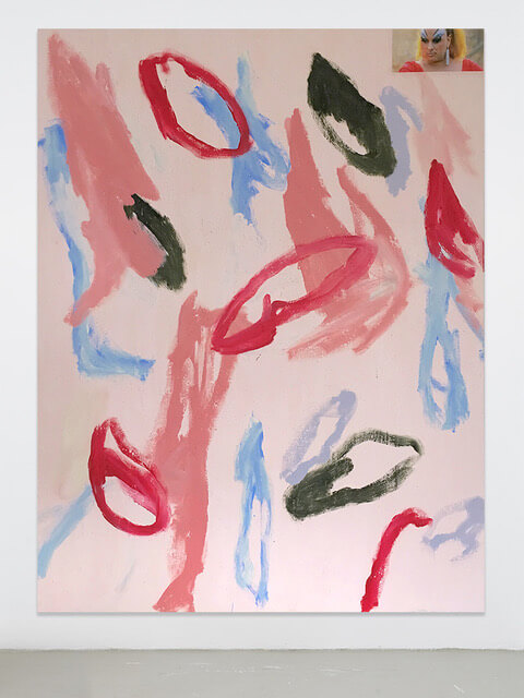
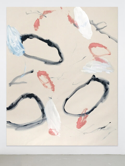
These are all questions that are addressed in ‘The Politics of Pink’, a group show that includes the works of seven male artists: Richie Culver, Matthew F Fisher, Elliot Fox, Albert Riera Galceran, Jonathan Lux, Reuben Beren James and Konrad Wyrebek. Each artist has either created specific work for the show or have carefully selected canvases from their practice that they feel engage with the socially charged debate around the relevance of a specific colour and the associations it brings to mind. The exhibition attempts to dismantle pink semiotically, hoping to differentiate between an artist’s personal associations with the colour and any sentiments about it that we assume to be objective truths. By focusing exclusively on the male artist, ‘The Politics of Pink?’ intends to examine a topic that is strongly linked to cultural dynamics that we find increasingly in a state of flux.
To accompany the show each artist has answered a few questions, which aim to provoke an engaging debate around their associations with the colour :
Are there particular motivations behind your use of the colour pink?
Richie Culver: Not really. Maybe there is on a subconscious level for sure. Depends on how deep you wanna go with it…
Elliot Fox: Not particularly, I would say I use colour aesthetically rather than conceptually in most cases. I group pink with other soft colours which frequent my work. The motivation behind using a softer palette is to utilise the way these colours contrast with what I’d class as a bolder palette; the aim being to affect your optical experience.
Saying that, pink can fall into both of these palettes. In short, the motivations of using pink most likely depend on how the pink will interact with the other colours that are already present in the work.
Matthew F Fisher: It’s hard to make rose and blue paintings without thinking of Picasso’s masterful work from 1901-07. The oldest work here, The Rose of Nowhere, was created during my residence at Yaddo in 2015. While there, I made eight paintings in total. In order to break up all the blue paintings, I wanted to make a work as opposite as I could color-wise. Pink was the perfect answer and I followed my artistic gut. The works from 2016 have a personal secondary reading, as my wife and I experienced the awe of our first pregnancy, we chose to not find out the sex of our baby. During this time, I consciously made works exclusively in blue and pink as an awe to that unknown and to play up the stereotypical color choices often associated with gender.
Albert Riera Galceran: I think in my case it’s something spontaneous. I’ve always liked pink as a colour, it’s appealing to me so when I started painting it was natural for me to use pink. I use it a lot; I have a strong connection with it.
Jonathan Lux: For me, colour selection tends to be an intuitive process. I do like pink, acid greens, and earth tones, so sometimes I might be motivated to use them less, so my predilections don’t interfere with setting the proper course of a picture, and getting its tone right from the beginning. Williamsburg makes a really great colour, Dianthus Pink, which is one of my favorite colours. It’s sort of like chewed bubblegum. Super light in tone. It’s full of potential, and I use it regularly.
Reuben Beren James: In this series I am exploiting the cultural baggage of pink and it’s relationship with femininity.
Konrad Wyrebek: It makes me feel excited. I think of my childhood, happiness, summer, fruity flavors and sex… probably outdoors. I don’t see it as either masculine or feminine I simply feel it evokes joy!
What do you associate with the colour pink when you apply it to your practice?
RC: On a basic level it often softens a painting. On a deeper level – depends on how deep you wanna go – How long you got?
I was brought up by women. Women have taught me everything I know in life. Everything. I’ve learned nothing from men. If pink is to be seen as a feminine colour, then it’s obvious I would use it.
EF: I would hold more association to the characteristic of the paint itself. I like to use flat matte paints alongside glossy and metallic colours which I feel reflects certain industrial process’ I want to represent within my work.
MFF: It’s a powerful color. As a child the sight of pink made me dizzy. Now that I am older, I find it the most beautiful color, artificial, mysterious, unknown, in nature. It’s a way to paint the most natural of subjects, the landscape, in an other worldly way.
ARG: In my practice it’s an important colour. I even wrote an essay on color harmony in which I explained my theory of pink being the most harmonious color. It’s always the color that makes all the others come together, it creates a unity and balance within the painting. I even try sometimes to not use it just as a way of trying to create harmony within the canvas in a different way but often it just turns out to be the color missing, the one that I’m trying to find.
JL: In general, I do my best to avoid assigning meaning to colour. That’s the audience’s job, perhaps.
RBJ: For me it varies, I will often engage with colour – pink included, without considering its associations outside the formal context of the piece of work, however with this ongoing series I am choosing to exploit the cultural connotations pink has with femininity through titling.
KW: My work comes from distorting figurative images found in medias and published on social networks. I don’t use pink that much, therefore the painting you see in this show is rather special. I will leave it open to your interpretation but the source material consists of you-porn, a Brexit 2018 update, a flock of flamingos and latest Ms. Angela Merkel’s pantsuit!
Do you agree that in art the shade pink can be used as a tool to subvert and distort its traditional cultural associations?
RC: I don’t know.
EF: I agree it can be – depending on what traditional cultural associations you hold to it. I realise that the use of pink in my work, which discuss ideas surrounding masculinity, could be seen to subvert these traditional ideas. I don’t feel this is a conscious and deliberate ploy on my behalf, but if people want to apply this narrative to my work as a viewer, then it doesn’t really bother me. I’ve always been interested in laying foundations in my work that can allow people to draw different conclusions – That’s half the fun.
MFF: When a constant is known, pink equals femininity, it becomes more interesting to invert that structure and play it against itself. After awhile, that too becomes known. To then bend it back towards the original stance but allow it to stay in the middle, where it can be one, the other, both, or neither creates a more complex reading of the work.
ARG: I do agree that pink is a color that socially has always related to femininity but that isn’t something that bothers me. I’ve been told many times that my paintings look like a female artist has painted them. In a way, I think it makes sense to me because I do have a feminine side and I guess my paintings show that but at the same time I do think that we shouldn’t create a barrier between gender when we’re talking about pink or any other color. I think the importance is in the way it’s used more than the color itself. Pink is a beautiful color and everyone should feel free to use it and give it personal significance.
JL: Sure it can. I think its just fine for colour to be weaponized for a mischievous purpose, but not every work would need that tactic, so it’s important to not abuse the tool. I think subversion can only find its mark if it comes as a surprise. Often a degree of detachment from wondering what a colour is up to, can lead to a more unexpected and satisfying outcome.
RBJ: I would like to believe so and to an extent I agree, what interests me about art – at least in my own work, is its relative position in regards to how it is understood. The art world provides an environment where artists can choose to utilise things like colour in an attempt to subvert or reinforce cultural associations, but what I find interesting is how regardless of intention people will impose their own form of classification onto these works, and in this respect, any perceived power to subvert or distort is taken out of the hands of the artist and placed into those of the viewer.
KW: Yes I definitely agree. Art is like another universe where we freely construct and deconstruct old and new ideas and throw them out there, to see if the world is going to swallow it. More likely just lick it like a strawberry ice cream.
Curated by India Whalley, Lara Monro and Marta Szymura